
If you’ve ever asked yourself how you’d make a Python script that could output a hydropathy graph from a protein sequence, you’re a gigantic nerd, and need to go out more.
If you’re still reading, I have no questions about your social life. While you try to remember the feeling of sunlight, please feel free to check out this dissection of my script.
Introduction
Ever since a lesson with one of my great professors (Mdme Le Tilly) where we tediously had to make hydropathy graphs by hand(ish) with Microsoft Excel, I’ve wondered how easy it would be (and how impressed my girlfriend would be) if I made a small program to automate the process using Python. I’ve seen some bioinformatics tools on the Expasy website that could already do a hydropathy analysis using a protein sequence, so this is nothing groundbreaking, but I gave it a go anyway.
What is Hydropathy?
The hydropathic index is a chart used to compare the relative polarity of amino acids. For the uninitiated, amino acids are the train carts of the protein train, and polarity is a property of a molecule which dictates its affinity with water.
The Kyte-Doolittle index does Doo-much, as it has assigned a numeric value to each amino acid, allowing one to chart a protein as a function of position and hydropathic value.
This is useful for attempting to identify regions of proteins which are transmembranous (discussed again later).
How does the script work?
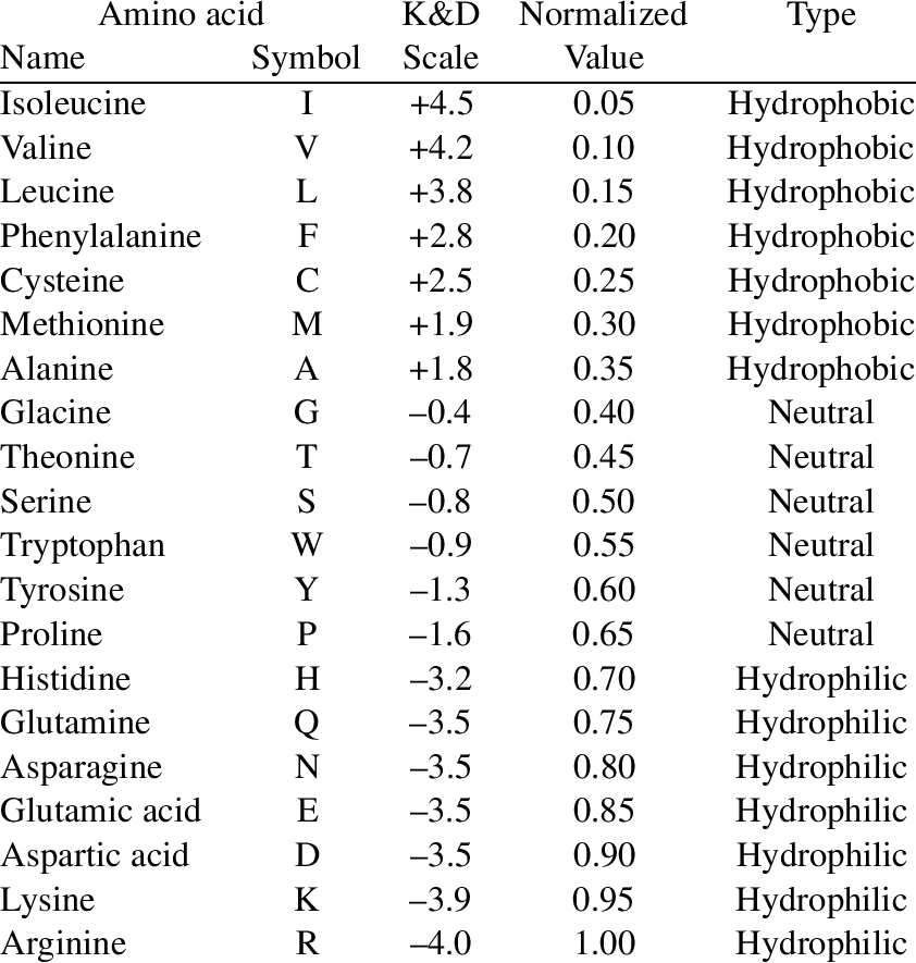
Input is the amino acid sequence in FASTA format (fancy term for capital letters with no spaces lol (and N-terminal first)). The output is the following chart:
Sonic the hedgehog protein hydropathy chart, using hydropathy.py script, window = 1
Between the input and output, the script takes the protein sequence and turns it into a sequence of plot points using the Kyte-Doolittle index and the position in the sequence: (acid number, hydropathic number). Then the plot points are graphed using the matplotlib library.
For example, the protein sequence ACDC would be converted into:
(1, 1.8), (2, 2.5), (3, -3.5), (4, 2.5)
The sequence for Sonic the hedgehog protein (a real protein named by real scientists) in FASTA format according to UniProt is:
MLLLARCLLLVLVSSLLVCSGLACGPGRGFGKRRHPKKLTPLAYKQFIPNVAEKTLGASGRYEGKISRNSERFKELTPNYNPDIIFKDEENTGADRLMTQRCKDKLNALAISVMNQWPGVKLRVTEGWDEDGHHSEESLHYEGRAVDITTSDRDRSKYGMLARLAVEAGFDWVYYESKAHIHCSVKAENSVAAKSGGCFPGSATVHLEQGGTKLVKDLSPGDRVLAADDQGRLLYSDFLTFLDRDDGAKKVFYVIETREPRERLLLTAAHLLFVAPHNDSATGEPEASSGSGPPSGGALGPRALFASRVRPGQRVYVVAERDGDRRLLPAAVHSVTLSEEAAGAYAPLTAQGTILINRVLASCYAVIEEHSWAHRAFAPFRLAHALLAALAPARTDRGGDSGGGDRGGGGGRVALTAPGAADAPGAGATAGIHWYSQLLYQIGTWLLDSEALHPLGMAVKSS
Nitty Gritty
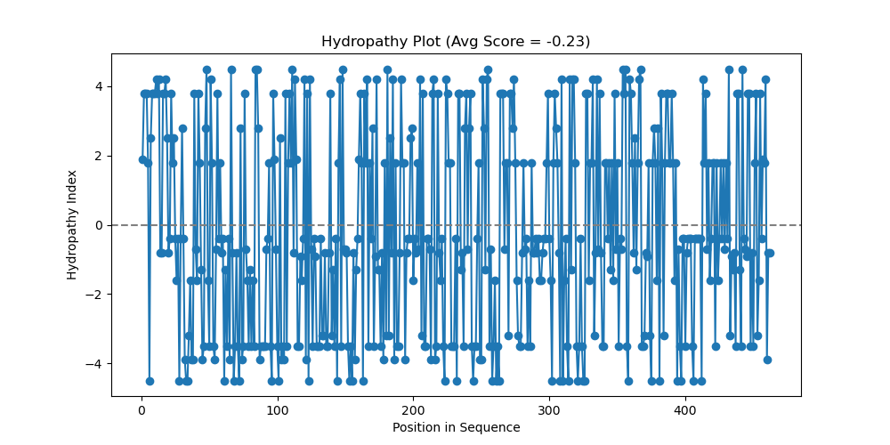
An important feature I’ve left out for simplicity is the aspect of a window.
If you just plotted the hydropathic values for each individual amino acid, things get a bit jumpy and the data can be hard to read. To help average things out, we average things out, by averaging things…..out. A window given to the script is the number of amino acids you want to average for each position, so a window=3 would average the first, second, and third acid for the first plot and then the second, third, and fourth acid for the second plot.
Nitty Nitty Gritty
It should be mentioned that you don’t average anything before the first amino acid, so if you have a window of three, technically you would not have any value for the first plot point, and then on plot point two you take the amino acid on the position (so 2) and the acids before and after (1 and 3 respectively).
Here is the same hedgehog protein (a real Homo sapiens protein), but with a window=20 instead of 1:
Sonic the hedgehog protein hydropathy chart, using hydropathy.py script, window = 20
Sprucing up the place
What are we looking at? Looks like a mountain range drawn by a 2nd grader.
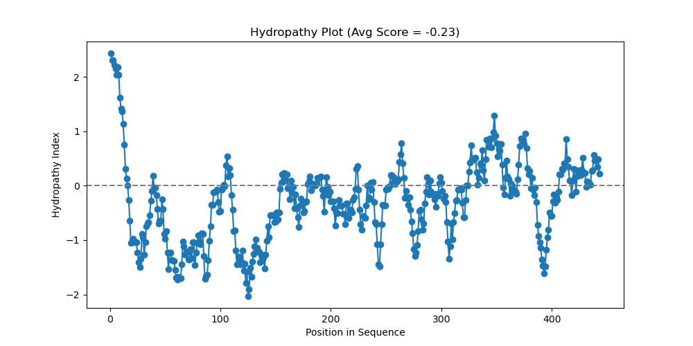
We’re looking at a scientific chart for god’s sakes! To make it professional and add some pretty colors, a revised version of the script was made with the handy AI we all know and love.
Here is the Sonic the hedgehog protein (I’ll never get over that) with a window of 20 and the pretty colors:

Sonic the hedgehog protein hydropathy chart, using hydropathy2.py script, window = 20
Now to review; we’re looking at a protein sequence, where regions that are lower are more hydrophilic (that’s why they are blue!). Higher regions are more hydrophobic (they don’t want to go in the blue water!).
What can we infer from this data?
Regions of hydrophobicity can suggest regions of transmembrane identity (it goes through a membrane). It could also be a region that folds into the protein, among other things (speak to your local biologist if you experience any other symptoms).
For anyone who thinks Expasy is too far away or feels the need to critique my code here’s the zip file:
That’s about it, hope you found the illumination into the bioinformatics background interesting. Take care!

Leave a comment